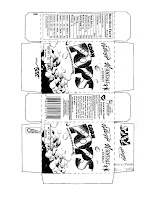
 Today we will begin using PhotoShop to create a new product -- in this case, a box of cereal. We will be creating the box in 2D (flat on a page) as a foldable model to be constructed in 3D. For example, your model may look like the "Pops" box (on the right) in 2D. To begin with, download this cereal box template and begin blocking in your box. Look at examples of cereal boxes [I have a few in the classroom] and think about what common components exist on this type of packaging. Are the colors bright or muted? Are they multi-colored or monochromatic? Is the title large? Bold? Colorful? Does it have an outline? Is there a picture of the cereal on the box?
 Remember when you are looking for photographic components (i.e. cereal, bowls, spoon, cartoon animals, or whatever) that you look for large images. It's much easier to reduce the size of an image without distortion than it is to increase it. As you have found, expanding an image makes it blurry or grainy.
Next, think about cereal names:
- ______ Loops
- ______ O's
- ______ Nuggets
- ______ Smacks
- ______ Puffs
- ______ Crunch
- Honey ________
- Sugar _________
- Crunchy ________
- Apple ________
- Spam _______
If you are interested in going the extra mile and trying a fancy cereal box font, check out this tutorial: http://www.dzyneo.com/sugarpuffs.php
When you are finished, save a full-sized (4-panel) cereal box, but also save a copy of the cereal box cover that we can print for the wall. If you don't have a USB drive to save your work, I suggest getting one ASAP. I can loan you one of the USB drives we have for the class, but we're running low on these. Remember, you can also email PSD's to yourself as a backup. It's your responsibility to make sure you are saving your work -- especially now that we're ready to start Semester Two and you will be graded on projects [or lack thereof].
Have fun!
Also, this image was in the iStock.com "Free Image of the Week" gallery:
Recently Adobe (the makers of PhotoShop) did a contest asking graphic design students to create an "Adobe Cereal". Here are some examples of what was created (I don't expect your boxes to be anywhere near this professional!):


